Baby Blues App: Onboarding case study
Challenge: Pregnancy and early motherhood can be a vulnerable time, with 1 in 10 women experiencing mental health difficulties. Despite the prevalence of postpartum mental health issues, there was a clear gap in the market for an accessible, research-backed digital tool tailored to this demographic. Existing solutions were often overly clinical, difficult to navigate, or failed to address the unique emotional, cognitive, and educational needs of new mothers.
The challenge was to create an app that was supportive, evidence-based, and easy to use, helping women monitor their wellbeing, learn coping strategies, and feel empowered during a transformative period in their lives.
Solution: Baby Blues was designed as a Cognitive Behavioral Therapy (CBT)-inspired app to provide practical mental health support for new and expectant mothers. Key features included:
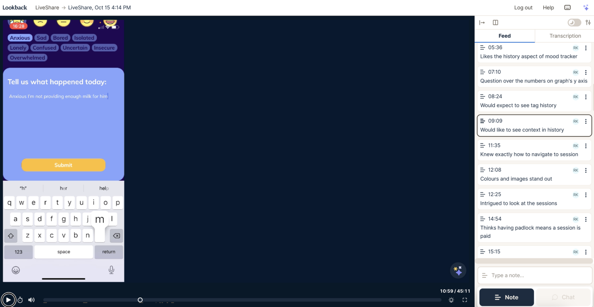
Mood tracking and journaling: Users could monitor their emotional state daily, helping them recognize patterns and triggers.
Educational sessions: Short, digestible videos addressed symptoms and coping strategies tailored to early motherhood.
Reinforcement exercises: Interactive exercises and prompts helped users internalize lessons and apply CBT techniques in daily life.
User-centered design: Intuitive navigation, gentle visual language, and personalised progress feedback ensured the app felt welcoming and supportive rather than clinical.
Impact: Though a passion project, Baby Blues achieved meaningful engagement and validation:
Positive user feedback indicated the app felt approachable, practical, and supportive during a challenging life stage.
Evidence-informed design ensured users could benefit from CBT techniques without needing clinical oversight.
The project strengthened my UX/UI design, research, and product strategy skills, particularly in designing for sensitive user groups with high emotional stakes.
My role: This was a solo project so I did UX, UI, research, graphic design, and, branding.
Branding
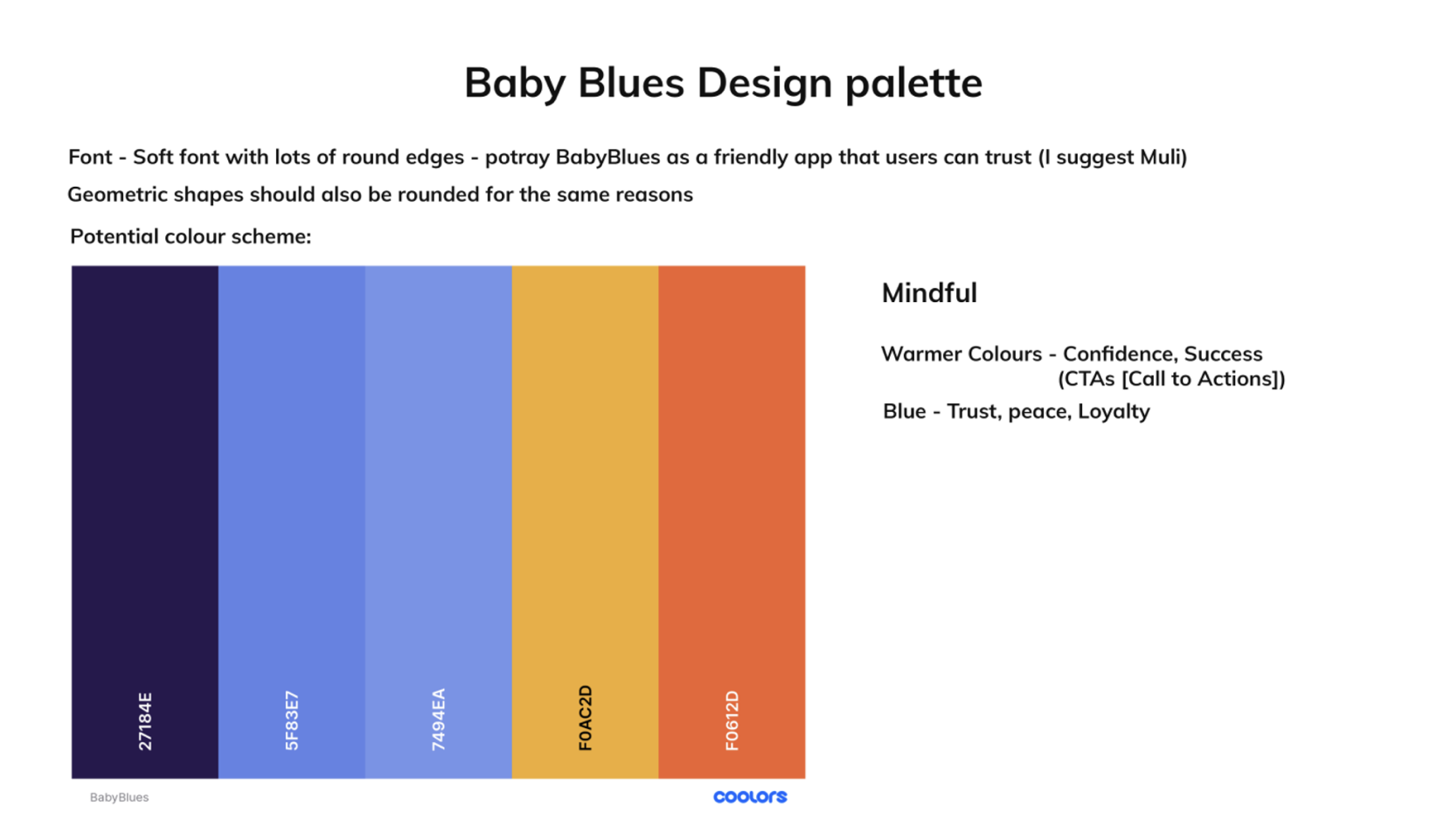
It was designed to create a sense of calm, safety, and approachability, reflecting the app’s mission to support new and expectant mothers. Key elements included:
Colour palette: Soft blue, gentle orange, yellow and purple were chosen for their calming yet uplifting qualities, providing a friendly and reassuring visual tone.
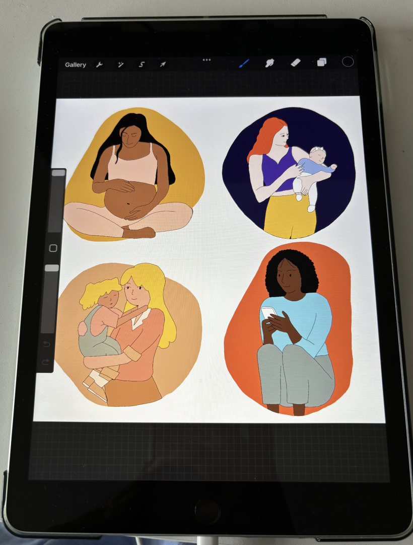
Illustrations and graphics: Custom-drawn graphics with rounded corners and smooth lines reinforced a sense of warmth, comfort, and accessibility.
Visual language: Every element, from buttons to icons, emphasised a gentle, non-intimidating style, promoting trust and a feeling of peaceful engagement.
Research
During COVID-19, in-person testing was not possible, so I conducted remote usability tests with new mothers using Lookback. This approach allowed me to observe users interacting with the app in their natural environment, capturing both their screen interactions and verbal feedback in real time
Outcome
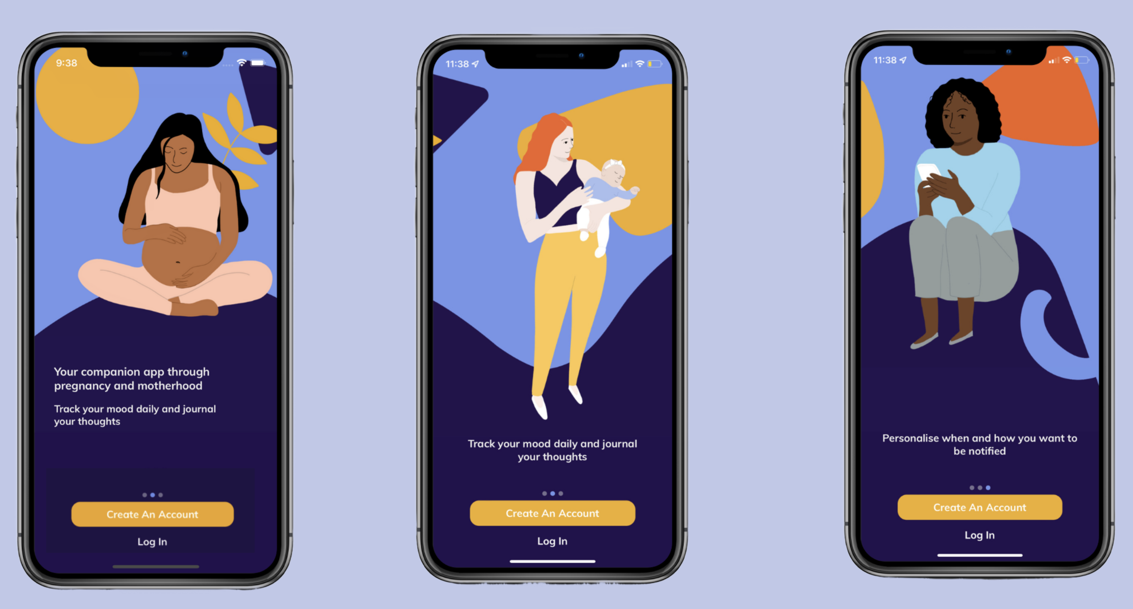
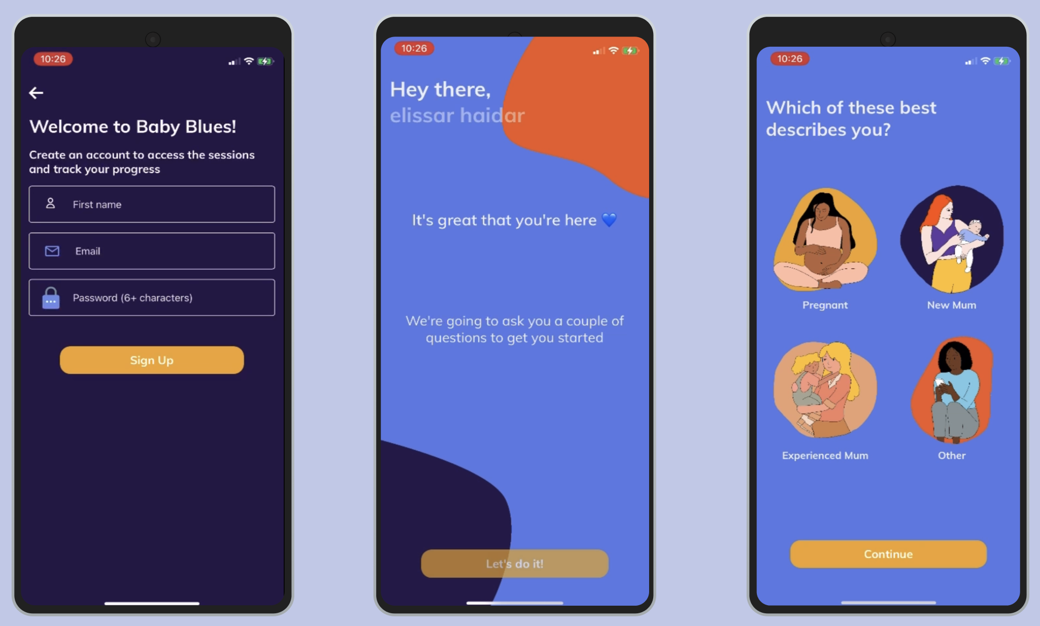
I designed an easy, intuitive user flow that prioritized clarity and simplicity. Key elements included:
Quick onboarding: New users could get started in minutes, with a short, guided introduction that clearly communicated the app’s value proposition.
Clear hierarchy: The app’s layout emphasized the most important actions first, helping users engage with the app immediately and understand how it could support them.
This approach ensured that users felt confident and supported from their first interaction, increasing engagement and making the app approachable for mothers during a vulnerable life stage.